Sometimes the data that you are creating in a spreadsheet is better understood if you can create a visual representation of that data. This is often best achieved by making a graph so, if you are working on a spreadsheet, you may find yourself wondering how to make a graph in Google Sheets.
Fortunately this is something that you can generate with just a few steps. Once the graph has been created you will have a number of different options for customizing the way your data is displayed. So continue below to find out how to make a graph in Google Sheets.
How to Make a Graph in Google Sheets
- Open your Sheets file.
- Select the data for the graph.
- Click Insert.
- Choose Chart.
- Adjust settings in the Chart Editor.
Our article continues below with additional information on creating a graph in Google Sheets, including pictures of these steps.
Tools You Will Need
- Computer with Internet connection
- Modern Web browser like Chrome, Firefox, or Edge
- Google Account
- Google Sheets file with data for graph
How to Create a Graph in Google Sheets (Guide with Pictures)
The steps in this article were performed in the desktop version of Google Chrome, but will also work in other modern Web browsers like Firefox and Microsoft Edge. This guide will assume that you already have a spreadsheet containing data that you want to put into a graph, but you can also create a new spreadsheet and add the data for the graph as well.
Step 1: Go to your Google Drive at If you aren’t already signed into your Google Account you will be prompted to do so.
Step 2: Open the Google Sheets file containing the data you want to graph, or create a new spreadsheet file.
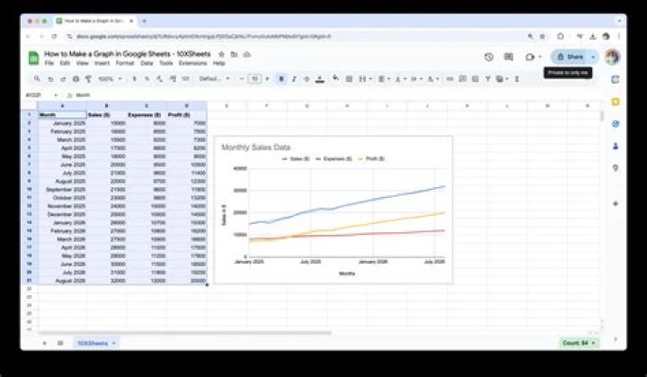
Step 3: Select the cells containing the data that you want to put on the graph.
Note that you will want to have a header row in row 1 that contains the names that you want to use for the x and y axis of the graph. In the image below that would be “Month” and “Number of Sales.”
Step 4: Click the Insert tab at the top of the window.
Step 5: Choose the Chart option.
Step 6: Find the Chart editor column at the right side of the window, where you will see a number of different options for customizing the appearance and layout of your graph.
There should also be a graph on the spreadsheet displaying your graphed data using the current settings in the Chart editor column.
Step 7: Adjust the settings in the Chart editor to get the graph appearance that you need for your work.
Google Sheets Chart Editor Options
The options in the Chart editor on the Data tab are:
- Chart type – Select the type of graph for your data. There are a ton of options on this menu, so you can experiment with them until you find the one that works best for you.
- Stacking – This option will let you display “stacked” data in your graph, but requires multiple columns and a specific format. You can read this article on Google’s support site for additional information on stacked charts.
- Data range – This setting defines the range of cells in your spreadsheet that are comprising the data display for the graph. You can change this if you want to use a different range of cells.
- X-axis – You can modify this to change the data that is being used to determine the x axis of the graph.
- Series – You can modify this to change the data that is being used for the y axis of the graph.
- Switch rows/columns – Turn your rows into columns and vice versa for the graph layout, which will affect the way that the graph data is displayed. This can be useful if you want to switch the x axis and y axis in Google Sheets.
- Use row x as headers – Select this if your data contains headers that you want to use to label the axes of your graph.
- Use column x as labels – Select this to use the data in the specified column as labels for your data.
- Aggregate column x – This lets you aggregate the data in the specifiedcolumn. Note that this may not change anything depending on the type of data in that column.
There are additional options available if you click the Customize tab in the Chart Editor. These options include:
- Chart style
- Chart & axis titles
- Series
- Legend
- Horizontal axis
- Vertical axis
- Gridlines
Additional Notes
- If you update the data in the cells that are populating the graph, then the graph will update automatically.
- While Google Sheets will save itself automatically when you make changes, this doesn’t happen if you lose your Internet connection. So make sure that you see a “Saved” note at the top of the page if you have done a lot of work that you don’t want to risk losing because you don’t have an Internet connection.
- If you click back into the spreadsheet, the Chart editor column will disappear. You can reopen the Chart editor by clicking the three dots at the top-right of the graph, then choosing the Edit data option.
Would you rather work on your spreadsheet in Excel than Google Sheets? Find out how to export a Google Sheets file for Microsoft Excel by downloading a copy of the file in the .xlsx file format.
- You can easily create a graph in Google Sheets to get a visual display of your data.
- Once added, you can further customize the chart or graph so that it displays the information in the most comprehensible way.
- Here’s how to use Google Sheets to create a graph to accompany your spreadsheet.
- Visit Business Insider’s Tech Reference library for more stories.
Spreadsheets can be extremely useful tools in themselves, but at a certain point, all that data can just be too much to process.
That’s when a chart or graph can help clarify things. If you use Google Sheets, you can easily add a chart to your existing spreadsheet in just a few simple steps.
Here’s what you need to know to get it done.
How to create a graph in Google Sheets
Creating a graph in Google Sheets is fairly simple as long as you’re logged into your Google account.
1. Open your Google Sheet, or create a new one by going to sheets.new and inputting your data into a sheet.
2. Select the cells you want to use in your chart by clicking the first cell and holding shift on your Mac or PC keyboard while selecting the other cells you want to include.
3. In the top toolbar, select “Insert” and then “Chart.”
4. Your chart or graph will then appear over your spreadsheet. Google Sheets will select whichever chart it deems as the best option for your data. However, you can always change the kind of chart or graph used by clicking the drop-down menu in the chart editor, located on the right-hand side of the screen.
Related coverage from Tech Reference:
How to edit Google Docs files offline, for when you’re without internet or trying to eliminate online distractions
How to set a print area in Google Sheets, so you can print selected cells or sheets
How to add a drop-down list in Google Sheets to group and organize data in your spreadsheet
How to make a pie chart from your spreadsheet data in Microsoft Excel in 5 easy steps
How to remove blank rows in Microsoft Excel to tidy up your spreadsheet
Insider Inc. receives a commission when you buy through our links.
For the last few years, the use of the Google sheets has been increasing substantially. The fastest backing up of files and data while working on them is one of the most remarkable features of Google docs.
Being a relatively new zone, users of the Google docs often find it difficult to use a few functions of formatting and styling that they have been used-to of seeing in MS Office.
This how-to guide is for the users who need a few tips and tricks to enhance the quality of their documents on Google docs. It shows step by step instruction on how to make a graph in Google Sheets.
In just a few steps users will learn how to add a graph in Google Sheets (an alternate version of MS Excel in Google Docs!) The first and foremost step of working on a Google doc is to start with a Gmail account to gain access to the complete set of features provided by the Google docs. Once you have logged in to your web browser (preferably Google Chrome), you will see a Googleapps icon in the top right corner of your main page.
By clicking this icon, you will see a dropdown menu showing a number of Google Apps that you can easily access with one click.
By scrolling down on the menu you will find the apps you must be looking for: Docs, Sheets, and Slides. By clicking on Sheets, you will be redirected to Google Spreadsheets aka Google Sheets.
The page will give you a few options to start your work with. You can simply select a pre-made template that fits your type of work or create a blank sheet to do your desired work.
Your sheet will be ready for work. You can input the desired information on the sheet and the Drive will immediately save your work after every few seconds.
You can also see the share button on the top right corner that has a lock on it. It means that only you can access your work as of now. Others can view or edit the file too if you give them access by clicking on the share button.
Now we will see how to make a graph of the information you have provided. Graphical representation of work makes it easier for the viewers to comprehend what the data is suggesting.
Also Read:
Steps on How to Make a Graph in Google Sheets
So, to make a graph of the information you have provided, follow these steps given below:
- Select all the cells that carry information you need to make a graph of.
- Then click on the insert button in the toolbar.
- Click on the chart option in the dropdown menu.
A pie-chart will appear on the screen. It is a pre-made chart that can be changed from the set of chart and graph types given in the chart editor on the right of the screen.
- Click on the dropdown option of the Chart type button. It will show a number of suggested charts and graphs.
- Choose any type of graph/chart you like.
For example, if you click on the column chart, it will appear on the screen with the data already plotted on both the axes.
- Once you have your desired graph/chart on your screen, you can edit it by simply clicking on it twice.
The font style, size and name of the graph/chart could be changed from the customize tab in the chart editor.
From the customize tab of chart editor we can choose if we want to keep the individual values of the items in the graph as well. The color of the graph can also be changed from this tab.
By checking the data labels box in the customize tab’s series option, we can see the individual values shown on every item in the graph.
In customize tab’s option chart and axis titles,there is a selection that allows you to change the titles of both of your axes along with the font style, size, and color alternatives.
From the setup tab of chart editor, you can choose what your x-axis would be.
Another important feature of graphs on Google Dos is the addition of a trendline. You can choose the kind of general direction or the average of the overall data. This will make it easier to express to the viewers the correlation between the two factors and the movement of data over a period of time.
The trendline can be selected from the series option of the customize tab in the chart editor. By checking the box, you will find a line going horizontally over your graph. This is the basic form of trendline called linear. The type of trendline could be changed as per your requirement from the given number of options.
Given above are the steps to use the graphs/charts option in the Google Docs. A number of qualities that exist in almost all the other types of graphs/charts are mentioned above. Besides, there are a number of other charts and graphs that are designed to fit the majority of users’ needs and requirements such as pie charts, bar graphs, line graphs, scatter charts. These types of graphs have further divisions among them, and you can choose the one that comes closest to your requirements and then modify it completely into your desired chart/graph.
- You can easily create a graph in Google Sheets to get a visual display of your data.
- Once added, you can further customize the chart or graph so that it displays the information in the most comprehensible way.
- Here’s how to use Google Sheets to create a graph to accompany your spreadsheet.
- Visit Business Insider’s Tech Reference library for more stories.
Spreadsheets can be extremely useful tools in themselves, but at a certain point, all that data can just be too much to process.
That’s when a chart or graph can help clarify things. If you use Google Sheets, you can easily add a chart to your existing spreadsheet in just a few simple steps.
Here’s what you need to know to get it done.
How to create a graph in Google Sheets
Creating a graph in Google Sheets is fairly simple as long as you’re logged into your Google account.
1. Open your Google Sheet, or create a new one by going to sheets.new and inputting your data into a sheet.
2. Select the cells you want to use in your chart by clicking the first cell and holding shift on your Mac or PC keyboard while selecting the other cells you want to include.
3. In the top toolbar, select “Insert” and then “Chart.”
4. Your chart or graph will then appear over your spreadsheet. Google Sheets will select whichever chart it deems as the best option for your data. However, you can always change the kind of chart or graph used by clicking the drop-down menu in the chart editor, located on the right-hand side of the screen.
Related coverage from Tech Reference:
How to edit Google Docs files offline, for when you’re without internet or trying to eliminate online distractions
How to set a print area in Google Sheets, so you can print selected cells or sheets
How to add a drop-down list in Google Sheets to group and organize data in your spreadsheet
How to make a pie chart from your spreadsheet data in Microsoft Excel in 5 easy steps
How to remove blank rows in Microsoft Excel to tidy up your spreadsheet
Insider Inc. receives a commission when you buy through our links.
If you are in a business, the growth or dip in your business is best analyzed with the help of a line chart. A line graph or a line chart has always been something widely used in the business circles. Have you ever give a thought to find how to make a line graph in Google Sheets? We thought of checking out and letting you find the best options to add a line to chart in Google Sheets.
What is a Line Graph?
A line graph is simply a graph that represents the data in the form of a series of points that you would mark on a plot. Connecting the dots or points creates a line and that is exactly why this type of chart is referred to as a Line Chart. Photo: Pinterest
A line chart is also referred to by several other names. A few prominent names used for line graphs include line plots, line charts, and curve charts. It provides you an easy to use functionality in letting you view the data in relation to different parameters and compare them together.
There are several ways to create a Line chart, and one involving the use of Google Sheets can prove to be extremely effective in more ways than one.
How to Make a Line Graph in Google Sheets?
Creating a Line graph on Google Sheets can be quite a tedious and complex task. If you are not aware of how to work with a line chart and Google Sheets, it can prove to be a tough task. However, if you are able to learn the complexities once, creating a Line Graph can prove to be quite simple and easy.
Here are a few of the steps that you can opt for in how to make a line graph:
Enter the data you want to plat on a Google Sheet. Do note that this should be the most essential step in how to create a line graph. The values entered in this sheet are transferred onto the line graph.
Select the data you want to create a chart with. In our case, we will create a chart with the data table. Simply select the table you want to create the line graph for.
Click on Insert -> Chart. If this is your first time that you are plotting a chart, Google Sheets picks the default chart type.
Choose the option for Line Chart or Line Graph in the Chart Type option. You can pick the options pr data that you want to add to the chart. Google Sheets also lets you customize your chart as per your preferences.
If you are looking to change the data that you want in the Chart on Google Sheets, you can pick them from the Chart Editor .
The video below should perhaps help you understand it in a more streamlined manner.
Customize the Line Chart on Google Sheets
The chart you created in the above steps is completely barebones and basic in nature. You may perhaps want to customize it further. Google Sheets lets you even do that. This will help you add the style elements to your chart.
Simply double click on the Line Chart. This will open Customise window. You can use this menu for adding Point sizes, shapes, color, and a wide range of other parameters.
Add Data Points to the Chart
Adding the data points to the chart should be one of the excellent options and help you make your chart stand out. To do this, you can simply go to Chart Editor and then choose Series. In this section, you can check the box for Data labels.
How to Create a Bar Chart in Google Sheets?
Creating a Bar Chart on Google Sheets is quite easy once you have learned how to make a line chart on the Sheets. You can double-click on the chart to open Chart Editor.
Once you are on Chart Editor, select Bar Chart under the Chart Type section.
How to Make a Scatter Plot in Google Sheets?
A Scatter plot is a chart that uses coordinates for showing the values in a two-dimensional arena. If you are wondering how to create a Scatter plot on Google Sheets, it offers you a simple and easy option to make a scatter plot without the need for any confusing steps.
Scatter plots can be a great option to show the trends and relationships in data. They can be a great way to show the datapoint clusters which a bar chart or line chart may not be able to show efficiently. Since a Scatter Plot shows the clusters of any data, you will find at which value most of the data is concentrated at.
Select the data in a table you want to create a chart for and insert the chart by selecting Insert -> Chart. Google Sheets will create a default chart. You can change it over to Scatter Chart by double-clicking on the Chart and picking Chart Editor.
Once in Chart Editor, you can simply choose the Chart Type as Scatter Plot. The chart is converted into the scatter plot option.
You can even add a Trend line to the Scatter plot if you want to. Go to the Customise option and then pick the Series section. Under the Series section, check the box for Trendline. Google Sheets will add a trendline to the chart.
How to Make A Pie Chart on Google Sheets?
The Pie Chart should be one of the excellent options for creating a Pie chart on Google Sheets. The Pie chart is normally used for displaying the distribution of the data across different categories.
Creating a Pie chart on Google Sheets should be an easy task. Like every other method used for creating a chart on Google Sheets, this method too involves selecting the table for the chart and pick the option Insert -> Chart. Once on the Chart options, select the Chart Type as Pie chart.
In case you want to show the percentage variation of the Pie chart, you can pick the option Pie chart > Slice label. You should find it under Customise option for the chart. Select the option for Percentage from here.
How to Make a Line Graph in Excel?
In a similar way as creating a line graph on Google Sheets, you can make a line graph in Excel as well.
In fact, it should be much easy creating a line chart on Excel than on Google Sheets since most of us have been better used to the spreadsheet solutions from Microsoft.
The steps should ideally be similar to the methods used in Google Sheets:
Create and select the table you want to create a hart for. You can select the entire table based on the chart in your plans. If you haven’t created a table of the data s yet, that should be the first step in creating a table.
Pick the option for inserting the Line chart. You can use the option for Insert and then pick Charts group. Under the list of Charts group, pick the option for Line Chart.
Once you have picked the chart style you want to create, the chart will automatically be created by making use of the data from the table.
You can then customize the chart by adding the title for the chart. You can customize the chart by clicking on the Chart Styles tab beside the chart and then select the different styles of the chart.
Summing it up…
Creating a chart in Google Sheets is quite simple and easy. In fact, Google Sheets does provide you a very simple option to customize and work with your charts. We would recommend learning the steps for each of the chart types and practicing them for gaining complete input into how to work with the charts.
If you are using Excel, you have probably learned so far to make a graph. Graph makes your data look much better and visible. Your document users would have less difficulties to understand and interpret the data. Especially those who rely on their visual experience.
How can I make a graph?
It is very easy to make a graph in Excel. In case you don’t know how to do it, here is a short explanation below. Further in this text you will also learn how to make a graph in Google Sheets.
- Open Excel and insert data (any version of Excel)
- Select the data you want to present in the chart
- Click on Insert button (next to the Home)
- Choose a chart
The chart will appear in your spreadsheet and you will be able to move it. Here you can find more details on how to embellish your charts.
How to Make a Graph in Google Sheets
You don’t need to be skilled with Excel, to learn how to make a graph in Google sheets. You just need to have a gmail account, online access and a little bit of patience to follow this guide.
Google Drive is very convenient because you can store files and have an online access to them whenever you need it. The same way you work in Microsoft Office suite, you can work in Google Docs and Google sheets.
Google sheets is very similar to MS Excel, and now you will see how similar is it to make a graph in Google Sheets.
First, sign in to your gmail where your Google Sheets file is located. Or if you haven’t created a Google sheets file yet, click the New button in the Google Drive . Then click on Google Sheets as shown on the image above.
Then write data in your sheet and with the left mouse click, select only the data you want to present in one graph.
Click on the Insert menu and then on Chart .
The Chart editor will open on the right side of the screen. In the chart type drop-down menu, choose an appropriate chart. In this guide we will show you how to make a line graph in Google sheets.
Select the Line Chart , which is the first chart to choose from. Then go to Customize tab and set up other options.
For instance, you can choose the font and its color, for every line individually. You can change the style of the graph and the look of the gridlines as well. Just click on the thing you want to change, for instance gridlines, and you will see all options.
Did you get it?
Google Drive can be useful when you are away from the office or home computer and you need to finish something. It is also convenient if you are working with someone else in the same document. So one way or another, it wouldn’t hurt if you learn how to make a graph in Google Sheets. Your data will be presented visually, even though you didn’t use Excel.
Google Sheets is a convenient alternative to Microsoft Excel. It offers many of the same functions in a cloud-based package. However, it can still be a challenge to read and understand large sheets of data. Here’s how to make a graph in Google Sheets to simplify your information.
The process of creating a graph in Google Sheets is similar to that of Excel, though you’ll have to be ready for a different set of buttons. We’ve grabbed our data from IDC, so you can always use that as an example and follow along.
How to make a graph in Google Sheets
1. Much like making a graph in Excel, the first step is to select your data. After all, an empty chart won’t do much for your readers.
2. Now head up to the Insert tab (located between View and Format) and scroll down to the Chart option. The Chart button is where you’ll find both charts and graphs in Google Sheets, there is no Graph button.
3. You’ll probably notice that Google Sheets defaults to a stacked column chart. It’s not perfect for everyone, but now we’ll dig into the Chart Editor (at right) to get everything just right.
- Creating a pie chart in Google Sheets is best for percentage data. However, it doesn’t work as well across multiple time periods.
- Creating a bar chart in Google Sheets is best for frequency data. It would work in this case, but it would be complicated based on how much data we have.
4. The first setting we’ll change is to choose a Line Chart. This helps us to illustrate the rise and fall of each manufacturer’s market share by quarter. Google will actually give recommendations for chart types based on your data input.
5. Once you’ve chosen your chart type, scroll down to check that the X-Axis and Series match the information you’ve selected.
6. The last step is to head to the Customize tab. This is where you can tinker with titles and legends as well as change the color scheme of your chart. You can also click on the title or legend in the chart to jump to the specific menu.
Now that you know how to make a chart in Google Sheets, it’s time to get out there and practice!
How to Make a Graph in Google Sheets. A complex spreadsheet can be very difficult to read through and understand.
If you are using Google Sheets, inserting graphs to your spreadsheet can help you present your data differently for easier reading. Here is How to Make a Graph In Google Sheets
Before I begin, you should know that there will be a slight difference in terminology. Google Sheets refers to all types of graphs as charts just Like Microsoft Excel.
You can use the Chart Editor tool to create these graphs and charts in Google Sheets.
Table of Contents
What Is Google Spreadsheet?
Google Spreadsheets is Web-based software that is available on all platforms.
This application permits users to create, view and modify spreadsheets within minutes. Spreadsheets can also be saved as HTML format.
How to use Google Sheets
- Download and install the Google Sheets app Play Store.
- Create, view or modify any spreadsheet.
- Share your work with others online.
Insert a Chart into Google Sheets
You can create various different types of graphs and charts in Google Sheets, from the most basic line and bar charts for Google Sheets beginners to use, to more complex candlestick and radar charts for more advanced work.
To begin, open your Google Sheets spreadsheet and choose the data you want to use to create your chart. Click Insert > Chart > and open the Chart Editor tool.
By default, a basic line chart is created using your data, with the Chart Editor tool opening on the right to allow you to customize it further.
Change Chart Type Using the Chart Editor Tool
You can always make use of the Chart Editor tool if you want to change your chart type. If this doesn’t appear on the right automatically, double-click your chart to display the menu.
In the “Setup” tab, select a different form of graph or chart from the “Chart Type” drop-down menu.
Different types of charts and graphs are grouped together. Click on one of the options to change your chart type from a line chart to something else.
Once selected, your chart will automatically change to match this new chart type.
Add Chart and Axis Titles
Newly created charts will attempt to pull titles from the data range you’ve selected.
You can edit this once the chart is created, and also add additional axis titles to make your chart easy to understand.
In the Chart Editor tool, click the “Customize” tab and then click “Chart & Axis Titles” to display the submenu.
Customize Chart Titles
Google Sheets will create a title using the column headers from the data range you used for your chart.
The “Chart & Axis Titles” submenu will default to editing your chart title first, but if it hasn’t, select it from the provided drop-down menu.
Edit the chart title to whatever you want in the “Title Text” box.
Your chart title will automatically change once you have finished typing. You can also edit the font, size, and formatting of your text using the options immediately below the “Title Text” box.
Adding Axis Titles
Google Sheets does not automatically add titles to your individual chart axes. If you want to add titles for clarity, you can do that from the “Chart & Axis Titles” submenu.
Click the drop-down menu and select “Horizontal Axis Title” to add a title to the bottom axis or “Vertical Axis Title” to add a title to the axis on the left or right side of your chart, depending on your chart type.
In the “Title Text” box, type a suitable title for that axis. The axis title will automatically appear on your chart once you finish typing.
As with your chart title, you can customize the font and formatting options for your axis title using the provided options immediately below the “Title Text” box.
Change Chart Colors, Fonts, and Style
The “Customize” tab within the Chart Editor tool provides different formatting options for your chart or graph.
You can customize the colors, fonts, and overall style of your chart by clicking on the “Chart Style” submenu.
From here, you can choose different chart border colors, fonts, and background colors from the drop-down menus provided.
These options will vary slightly, depending on the type of chart you’ve selected.
Google Sheets’ Advantages
- Collaboration.
- Working at Scale.
- Creating Charts and graphs
- Linking Between Sheets in Different Files.
- Working with Plugins.
- Connecting to External Data Sources.
Conclusion
You should have a glimpse of How to Make a Graph In Google Sheets after reading this post.
To save time, you can also set Google Sheets to automatically generate charts using a data range that you can continuously edit or add to.
Sometimes a spreadsheet can contain an enormous amount of data. So when it’s time to analyze that data or share the sheet with someone else, it can be overwhelming. However, a tool like a graph or chart not only displays your data in a unique form but also let you call out certain data for a clearer visual amidst the chaos.
Like Microsoft Excel, Google Sheets offers a handy feature for creating a chart easily. You can choose from several chart types and completely customize the chart for the ideal appearance.
Create a Chart in Google Sheets
If you have data that would fit perfectly into a chart, head to Google Sheets, sign in, and open your spreadsheet. Follow these steps to create the chart.
- Select the data for the chart. You can do this by dragging through the cells you want to use.
- Click Insert >Chart from the menu.
- You’ll immediately see your chart, using a suggested style. And the Chart Editor will open on the right. So you can click the Chart Type drop-down list and pick a different style like a line, area, bar, or pie chart.
Depending on the type of chart you use, the remaining Setup options in the Chart Editor will vary. For instance, if you choose a column, area, or waterfall chart, you can apply Stacking.
Data Range
For all chart types, you can see the Data Range. So if you need to make an adjustment or want to add another range, click the Select Data Range icon.
Axis and Aggregate
You can remove or add labels to the X- or Y-axis by clicking the Options (three dots) icon on the right of that item. If you’d like to Aggregate the data, check that box and then pick average, sum, count, or another option in the drop-down list.
Series
You have options to remove a series or add labels by clicking the three dots to the right of one. Or you can click Add Series at the bottom of the list for additional data.
Other Options
At the bottom of the Chart Editor, you also have the ability to switch rows and columns, use row 1 as chart headers, and use column A as labels. Just check the boxes next to the items you want to apply.
Move or Resize
- To move your chart to a different spot on your sheet, simply grab it and drag where you want it.
- To resize your chart, select it and drag from one of the corners or borders.
Customize Your Chart
Once you create your chart and organize the data as you like, you have ways to customize the chart. This lets you apply changes to the appearance like color, style, and gridlines.
If you’ve already closed the Chart Editor, you can reopen it easily. Click the three dots on the top right of the chart and select Edit Chart.
In the Chart Editor, click the Customize tab at the top. You’ll see several options for changing the appearance of your chart, each can be collapsed or expanded. These options vary depending on your chart type.
Chart Style: Change the background color, font, border, and overall look.
Chart & Axis Titles: Add text for the chart title, subtitle, horizontal, or vertical axis titles. Then, choose the font style, size, format, and color for those you use.
Series: Format the axis position and data point and select colors for items in the series.
Legend: Add, remove, and position the legend on the chart. You can also format the font.
Horizontal Axis and Vertical Axis: Adjust the font style, size, format, and color for the selected axis. You also have options to slant the labels on the horizontal axis and choose a scale factor for the vertical axis.
Gridlines and Ticks: Choose the spacing types and counts, add major and minor ticks, and pick the gridline color.
Again, the options in the Customize section of the Chart Editor depend on the chart you use. So if you pick a pie chart, for example, you can add a donut hole and select its size.
Time-Saving Tip: Not sure which section of the Chart Editor you need to access for a particular part of the chart? Make sure the Chart Editor is open and then click the item directly on the chart. This action will display the expanded corresponding area in the Chart Editor to make your edits.
Create a Chart in Google Sheets for Data Visualization
If you want to call attention to particular data or simply view your data in a visually pleasing way, create a chart in Google Sheets. You have complete flexibility with how your chart looks and the data it shows.
Need a little help with charts in Microsoft Excel? Take a look at our walk-through for creating a Gantt chart in Excel. Or check out how to create a pie chart in Excel 2010 if you are running an older version of Office.